Think about the last time you were browsing a bookstore. The front covers of the books are likely the thing that drew your attention enough to pick up a particular book. But I would wager the first thing you did after making a selection was to turn it over and look at the back cover of a book.
While the front cover is meant to draw attention, the back of a book holds a wealth of information that can persuade a reader to purchase that particular book over all the others on the shelves.
Designing the back cover of a book is no more difficult than designing the front cover, but you’ll need to consider different things—primarily, the information that needs to be included in a relatively small space. While you don’t have to include everything in the list below, you’ll want to carefully weigh the pros and cons of each type of information and whether it benefits readers who might pick your book up from the shelf of their local bookstore or library.
Here’s what you need to know about designing the back cover of a book:
1. ISBN and Barcode2. Book Synopsis or Blurb3. Endorsements or Reviews4. Tagline or Hook5. Author Bio6. Author Photo7. Genre and Category Information8. Awards or Accolades9. Publisher Information10. Call-to-ActionDesign Choices for the Back Cover of a BookFinal Thoughts1. ISBN and Barcode
This is really the only thing that the back cover of a book absolutely must contain if you want your book to be sold via retail channels. The ISBN and barcode are what allow retailers to order your book from distributors, track your book in their inventory systems, and also provide information about pricing when a reader purchases the book. Without this, most retailers won’t carry your book (yes, this includes online retailers, too!).
While there are certain standards for how your barcode must appear, some book designers have fun with this part of a book back cover and incorporate it fully into the rest of the design.
2. Book Synopsis or Blurb
While your front cover is generally the thing that gets a potential reader to pick up your book, if you spend a few minutes observing in any bookstore, you’ll find that readers almost immediately turn a book over to see what’s on the back of a book. Usually, they’re looking for the book’s synopsis or blurb. You’ll want to keep this short—generally no more than a paragraph or two—and make sure that it makes readers want to read the book itself.
Your synopsis is the best sales tool your book has when you can’t be there to talk to readers directly. In fiction, it gives them an idea of the world you’ve created, the characters that inhabit that world, and what happens to them. In other words, it tells your reader why they should care about the narrative you’ve written.
In nonfiction, the blurb tells readers what they’ll gain from reading your book. What problem are you solving for them? What new thing will they have when they finish reading your book? Be sure your synopsis tells them.
3. Endorsements or Reviews
If you’re lucky enough to find other well-known authors to write an endorsement for your book, the back cover is often where you’ll put that endorsement (unless it’s a really well-known author—then you might want to put it on the front cover). Reviews of advanced review copies (ARCs) can also go here, as it lends credibility to the book and creates social proof that makes readers more likely to take a chance on an author they’ve never read before.
If you’re lucky to have dozens of reviews or endorsements, you’ll need to pick and choose which ones are the most relevant to your readers. Prioritize endorsements from well-known authors within your genre, followed by glowing reviews from others. In general, you’ll want to include three or four reviews at most.
4. Tagline or Hook
While this is sometimes incorporated into the first line or the blurb or synopsis, setting your book’s tagline or hook apart in larger text above the synopsis can draw readers in faster. Your hook or tagline is usually a single sentence or question that will pique the reader’s interest and entice them to read more.
Set your tagline or hook apart from the rest of your synopsis by using larger typography, a different typeface, or bold text. This should stand out and be the first thing that catches a reader’s eye on the back cover of a book.
5. Author Bio
Not every author includes an author bio on the back cover of a book, but many do. It’s often a shortened version of their full bio and includes any tidbits of information a reader might find compelling.
In the case of nonfiction, the author bio becomes more important, as it lets the reader know why this particular author is an authority on their subject matter. If the back book cover you’re designing is for a nonfiction book, be sure the author bio includes the author’s credentials in relation to the book’s content.
6. Author Photo
Like an author bio, an author photo isn’t required to be on the back cover of a book, but it is a nice touch that makes the author more “human” to the reader. An author photo should be professional, but that doesn’t mean it can’t have some character or show insight into the author’s personality.
In general, you’ll want to keep your author photo consistent between different books. Readers will come to recognize you through that photo, so if it’s constantly changing, you’re diluting your author brand.
7. Genre and Category Information
The genre or category information is generally found near the barcode on the back of a book and gives retailers and libraries information on where the book should be placed on the shelves. This information is rarely used by readers but is essential for selling your book.
8. Awards or Accolades
If an author has won awards in the past for their books or the book itself has won an award or accolade, including this information on the back of the book is a good idea. Of course, if the award is a major one—recognizable to the average reader, like the Hugo Award for speculative fiction or a Caldecott Medal for children’s books—placing it on the front cover is a better idea.
9. Publisher Information
The publisher’s name and imprint logo regularly appear on the back cover of a book to give readers an idea of where the book came from. For self-published books, if the author has created a publishing imprint or author logo, be sure to include that near the bottom of the book’s back cover.
10. Call-to-Action
A call-to-action often includes the author’s website address or an invitation to check out the author’s other books. This entices readers to learn more, and can be especially useful if the author is unknown to the reader. It lends credibility to the author if they have a website or have published other works, and readers might check those out prior to making a purchase.
Design Choices for the Back Cover of a Book
There are multiple design choices you can make when creating the back cover of a book, beyond just fitting the proper information in the available space. Some designers opt to keep the back cover simple, often just using a background color that echoes the front cover. But other designers incorporate elements from the front cover or the story to really make the back cover stand out.
Here are a few great examples:
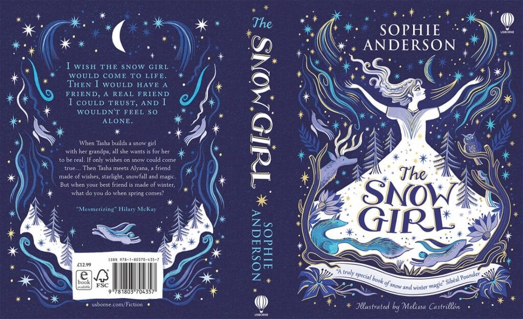 Book cover design by Melissa Castrillón.
The back cover for The Snow Girl includes a hook set apart from the blurb, along with a one-word endorsement. The designer created a wavy box around the barcode to better incorporate it into the overall design. Other design elements from the front cover are used as a border around the content on the back cover.
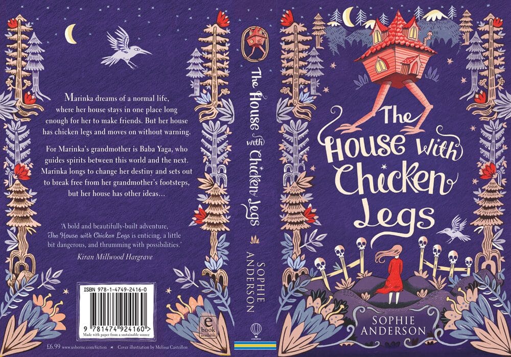 Book cover design by Melissa Castrillón.
Here’s another example of a cover that uses design elements from the front cover to create cohesiveness with the book’s back cover. The subtle border around the barcode adds to the design. Beyond that, the content is kept simple: just a blurb with an endorsement.
 Book cover design by Helen Crawford-White.
The design from the book’s back cover wraps right around to the front cover, creating a larger illustration. The layout is kept fairly minimalist, with just a blurb, tagline, and the barcode and ISBN information included.
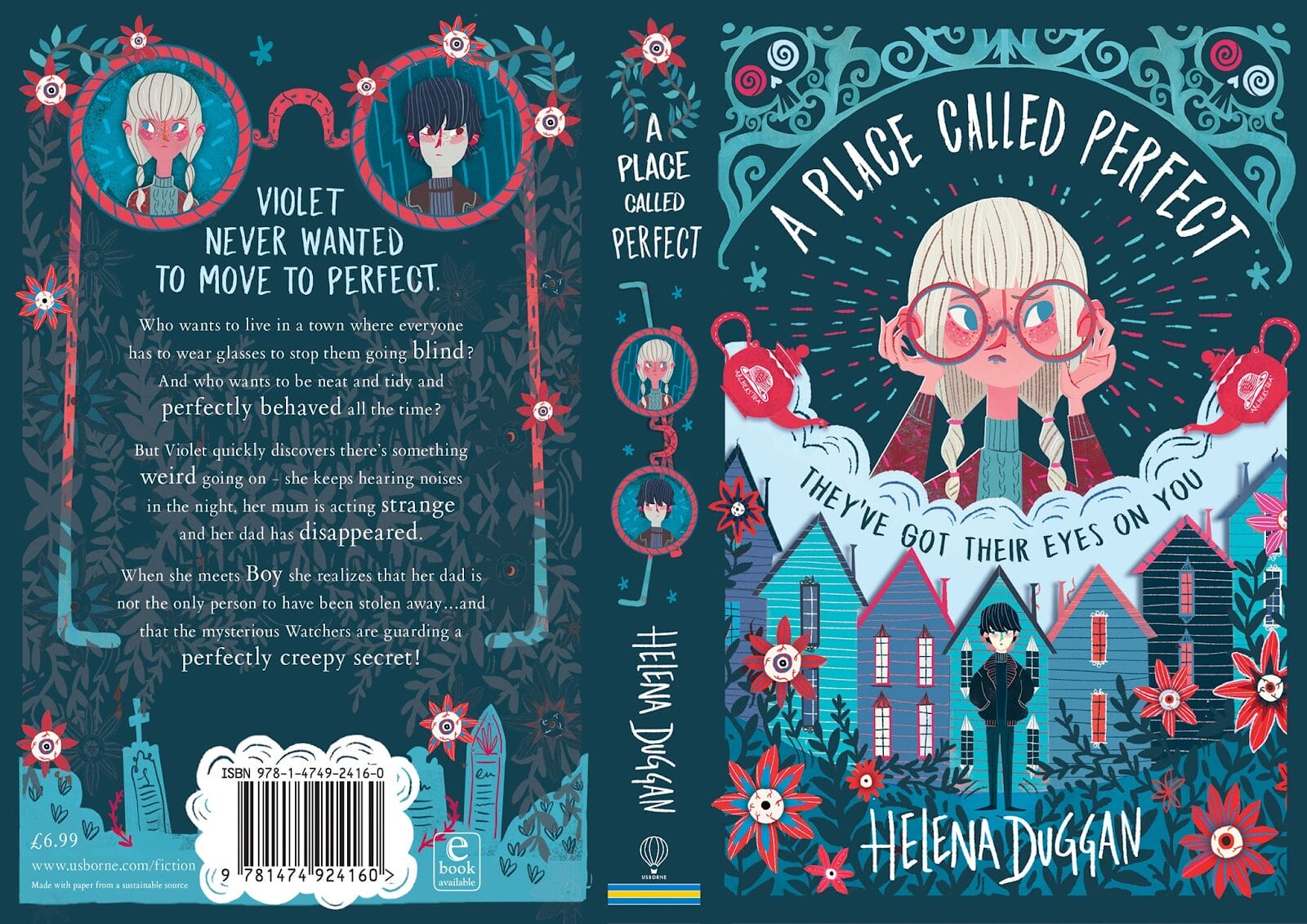 Source
Including illustrations of what we assume are the two main characters on the back cover as portraits is a nice touch on the back cover of Helena Duggan’s A Place Called Perfect. The typography in the blurb is a subtle but powerful design choice, with keywords highlighted in slightly larger text.
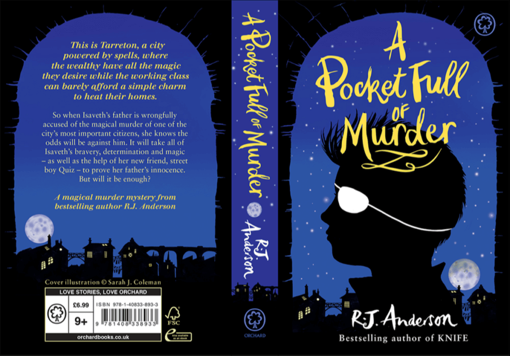 Book cover design by Sarah Jane Coleman.
The view out a window of the skyline from the front cover is reproduced on the back cover of R.J. Anderson’s A Pocket Full of Murder. Otherwise, the design is kept simple, with a tagline and blurb included above the skyline.
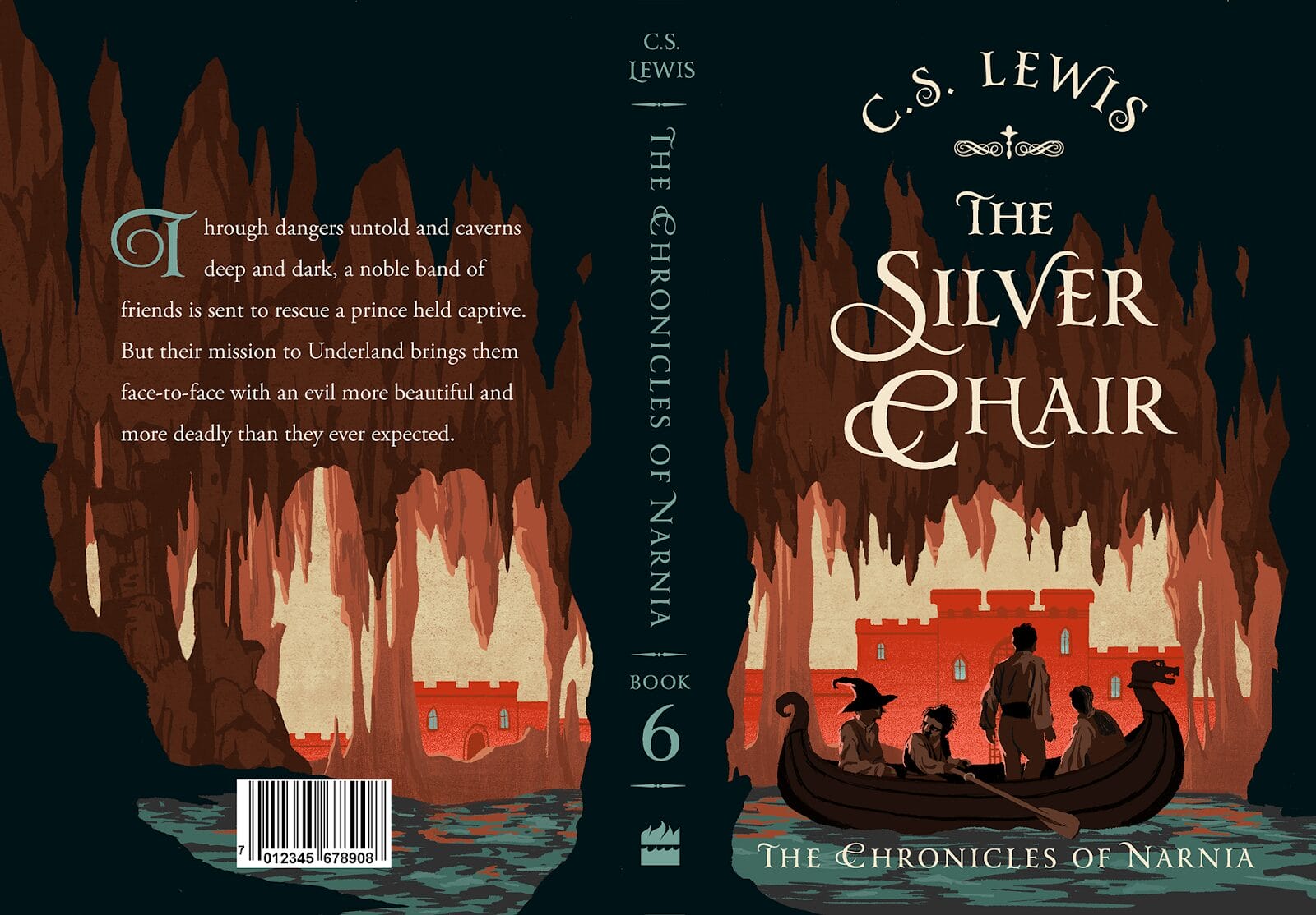 Book cover design by Jeffrey Nguyen.
Jeffrey Nguyen’s interpretation of the classic The Silver Chair by C.S. Lews (part of The Chronicles of Narnia series) continues the cave and water imagery from the front cover on the book’s back cover, with an otherwise simple design. There’s just a barcode and blurb included on the back of the book.
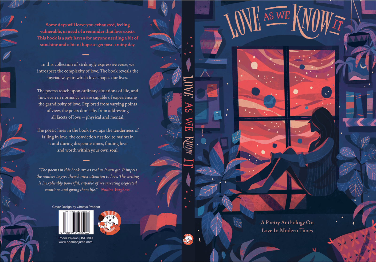 Book cover design by Chaaya Prabhat.
Taking the plant elements from the front cover and including them as a border on the back cover is an excellent design choice. The designer fits a lot into the back cover, too: a tagline, blurb, review, ISBN and barcode, publisher imprint, and website address, as well as credit to the designer.
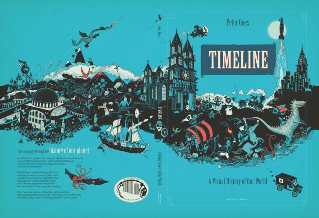 Source
The cover for Timeline uses the same image to wrap from the back cover onto the front cover, along with the same blue background color. The information on the back cover is kept simple: a tagline, blurb, and stylized barcode area.
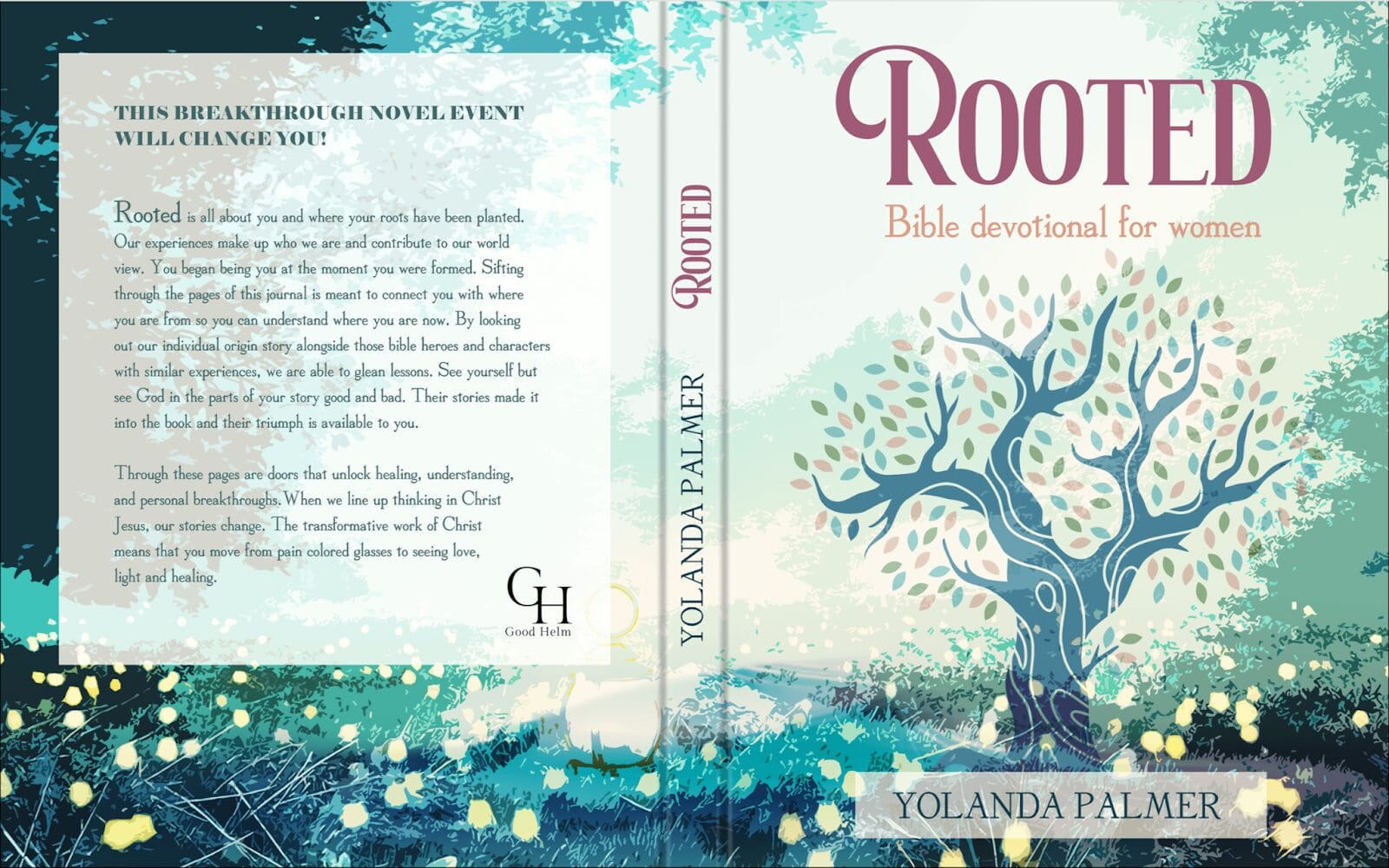 Book cover design by Magdalena Herichova.
Using an overlay color (white, in this case) to make text stand out is a great choice if the background image is too busy. There’s space for a barcode at the bottom (commonly added when the book goes to print), while the book’s tagline, blurb, and publisher imprint logo are all included in the overlay.
Final Thoughts
The back cover of a book is one of the most persuasive sales tools an author has at their disposal. There’s a lot of information to pack into a small space, so carefully edit your content until it conveys what you want without a single extra word.
Whether you’re a designer creating a book back cover design for a self-published author or an author creating your own book cover, the tips above will help ensure you include the information readers expect. Remember: a professional book cover is the first step in gaining new readers!


 Bengali (Bangladesh) ·
  English (United States) ·