When I was growing up in the ‘90s, one of my favorite things to do was ride my bike to the local library to peruse the shelves. Book covers, from what I remember at least, were predictable back then: westerns had cowboys on the covers, romance covers had steamy couples in provocative poses, kids’ books had illustrations of the main characters, and historical novels had historically accurate paintings gracing their covers.
These days, cool book covers abound, bending and even breaking the conventions of their genres. You can’t necessarily tell exactly what genre a book is by looking at its cover, although the best book covers still give you a taste of the tone and mood of the book. Below, we’ll explore what makes a cool book cover and give you some book cover examples that fit the bill (along with tips on how to design your own cover).
In this article, we’ll cover what you need to know about creating cool book covers:
What makes a cool book cover?Bestow the Darkness: A Gothic Romance by Amanda HockingLost in Yaba: Down and Out in Laos by Walt GleesonBeatless by Amber L. JohnsonBladestay by Jackie JohnsonThe Line Between by Beverly KnauerFrom the Mouths of Sirens by Abigail HairThe Wayward Thief: Book One of The Merrick Stones Series by Amelia IvesDivine by M.J. WoodmanDemons and Darlings: A Fake Dating Paranormal Romance by Emily BlackwoodFinal ThoughtsWhat makes a cool book cover?
To figure out what makes the best book covers, it’s important to consider what a book cover design’s job is. That job is twofold:
Catch the eye of potential readers as they’re browsing bookshelves in their local library or bookstore, or online. Convey information to potential readers about what the book is about.A cool book cover will go a long way toward achieving the first job, and will contribute to the second one as well. Book covers should be eye-catching, stand out from their competitors without deviating too far from genre standards, and tell readers what to expect from the book.
Bestow the Darkness: A Gothic Romance by Amanda Hocking
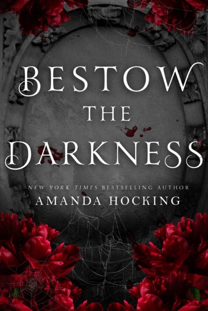
Genre: Gothic Romance
What Makes This a Cool Book Cover: Some of the best book covers are understated and only hint at the narrative contained within. That’s the approach taken for the cover of Bestow the Darkness. The background is reminiscent of a gravestone (fitting for a gothic romance), complete with spiderwebs. The bright red flowers on the edges of the cover are the only real pops of color, and serve to focus the attention on the book’s title.
Pro Tip: Consider elements common to your genre (like a gravestone in gothic romance) that show up in your book and figure out ways to incorporate them into your design.
Lost in Yaba: Down and Out in Laos by Walt Gleeson
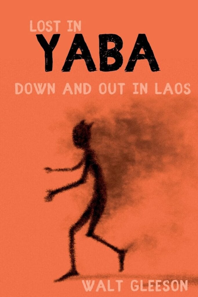
Genre: True Crime
What Makes This a Cool Book Cover: True crime books often have dark, brooding covers. Using bright orange for the cover of Lost in Yaba is a pretty extreme departure from genre conventions, but one that is sure to grab a potential reader’s attention.
Pro Tip: Don’t be afraid to break from genre expectations on your cover, especially if it ties directly into your book’s subject matter.
Beatless by Amber L. Johnson

Genre: Coming of Age
What Makes This a Cool Book Cover: It makes total sense for a coming of age novel to have an edgy, cool book cover. Beatless uses typography reminiscent of a vintage label maker with a black, white, and red color palette. It gives instant cool vibes that beg to be picked up from the shelf.
Pro Tip: Using a punchy color like red on an otherwise black and white book cover makes it stand out immediately.
Bladestay by Jackie Johnson

Genre: Young Adult Western
What Makes This a Cool Book Cover: The thing that instantly stands out about Bladestay’s cover is the woodcut style (reminiscent of antique woodcut printing blocks). Combined with a simple color palette and slightly rough edges, it creates a feeling of being in the old west while somehow remaining modern—partly because of the upside-down skyline that runs just under the title. It’s an unexpected design choice that keeps the cover feeling fresh.
Pro Tip: Inverting elements within your design can create an entirely new look that appeals to modern readers.
The Line Between by Beverly Knauer
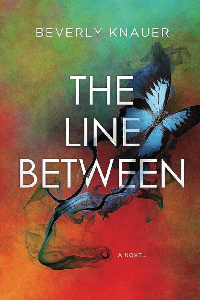
Genre: Fiction
What Makes This a Cool Book Cover: The color palette of The Line Between’s cover is what really makes it stand out. The painted background using shades of red, orange, and teal creates a visually appealing backdrop for the blue butterfly that appears to be leaving a trail of smoke behind it. Interweaving the simple typography into the smoke trail raises the level of professionalism, too.
Pro Tip: Interweaving the typography of a book’s title or author name with the background image is a subtle but impactful choice that elevates the design of a book cover.
From the Mouths of Sirens by Abigail Hair
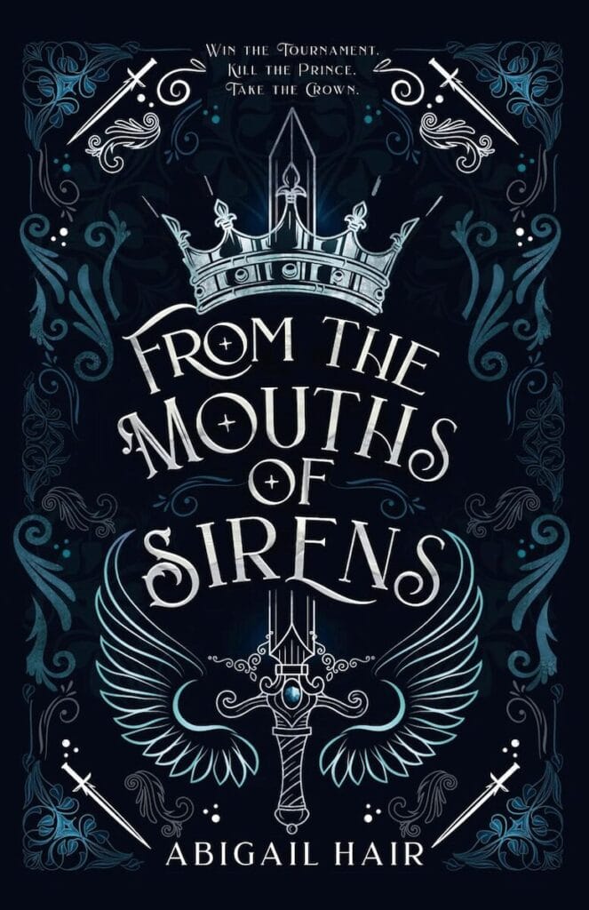
Genre: Fantasy
What Makes This a Cool Book Cover: There’s a trend among fantasy novels of using stylized elements from the book on the cover, without hinting much at the book’s plot. From the Mouths of Sirens does this beautifully, incorporating a crown, swords, and flourishes to create a mood without giving away the book’s narrative. The simple color palette and bold typography further elevate the design.
Pro Tip: Play with symmetry in the design to create a sense of order and stability on your book cover.
The Wayward Thief: Book One of The Merrick Stones Series by Amelia Ives
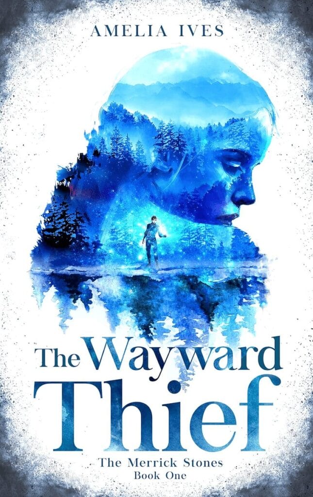
Genre: Young Adult Fantasy
What Makes This a Cool Book Cover: The Wayward Thief uses one of my absolute favorite design styles: superimposing an image over a shape (in this case, a silhouette of a young woman). It adds a ton of visual interest to the design and hints at multiple layers within the narrative. The white and blue color palette makes the cover look harsh, further reinforcing the setting of the book.
Pro Tip: Use color to reflect the mood of the book on the cover. Warm colors can give a sense of action, passion, and a quick pace. Cool colors can reflect a slower pace, a harsher setting, or a more chilling narrative.
Divine by M.J. Woodman
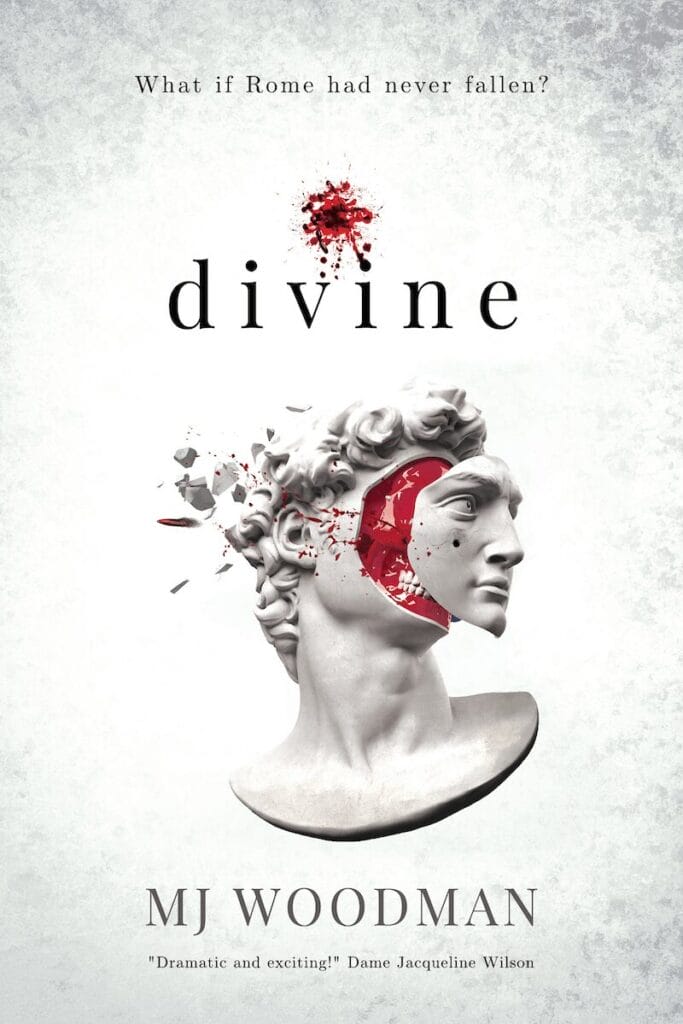
Genre: Alternate History
What Makes This a Cool Book Cover: For a relatively minimalist design, Divine’s cover tells us a lot about the book’s story. The Roman statue on the front reflects the setting, while the face being pulled off to reveal a gruesome skull underneath gives us a big hint that things might not be as polished as they appear on the surface. The blood splatter above the title draws our eye to this important bit of information, too.
Pro Tip: Resist the urge to put too much on a book cover. Sometimes a single impactful image with plenty of white space around it can be enough to make a book stand out.
Demons and Darlings: A Fake Dating Paranormal Romance by Emily Blackwood
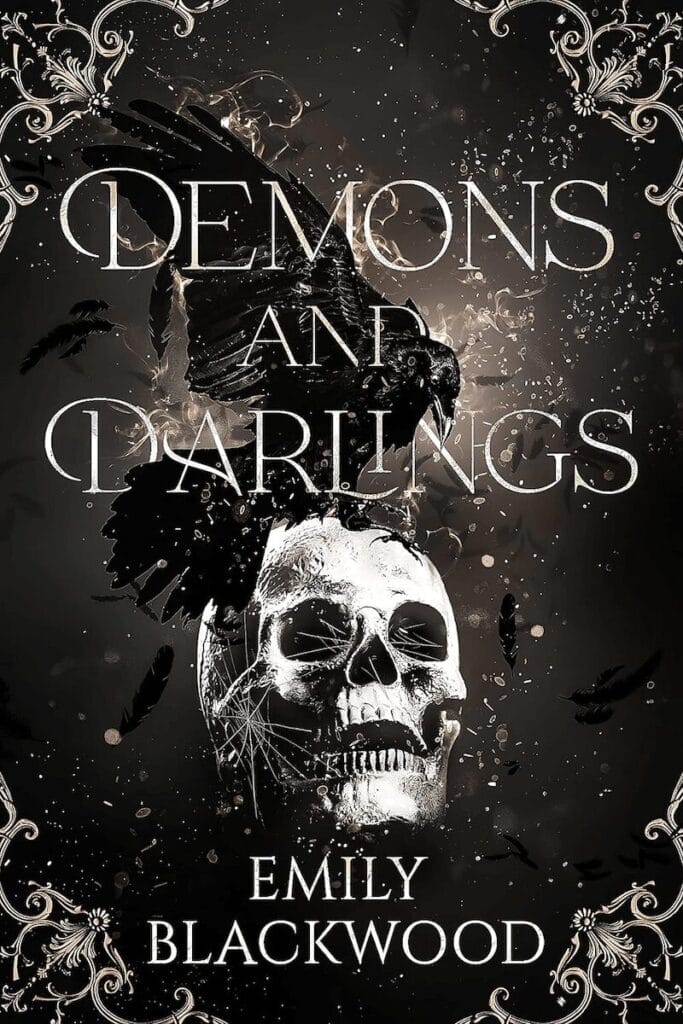
Genre: Paranormal Romance
What Makes This a Cool Book Cover: The cover for Demons and Darlings is pretty close to black and white (but with a more sepia tone), yet the imagery immediately pulls the reader in. The skull is the first thing that jumps out, and then we quickly notice the crow on top of it. The grungy, distressed look of the cover hints at the tone of the story and tells us that it might not be your typical paranormal romance.
Pro Tip: Texture can take a so-so cover and make it really stand out from others on the shelf. Using textured overlays on your design when appropriate can make an otherwise mediocre cover pop.
Final Thoughts
Whatever genre you’re writing in, having a cool book cover will help your book stand out from the many others it’s competing with. It can be as simple as using an unexpected color palette or incorporating elements not often seen in your genre. If you’re a self-published author, working with a professional designer to create a cover that accurately reflects your book is a great idea. But knowing what you want from your cover and having some ideas of how to make it happen can make working with a designer a much smoother process!




 Bengali (Bangladesh) ·
  English (United States) ·